SEED TIP OF THE MONTH | AUGUST
Emptying the Page to Empty the Mind
Enliven

What makes a viewer visit a website, stay for a spell, and repeatedly
come back again? What causes that attraction?
These days we have thousands if not millions of sites promoting similar products and sending out similar messages. Why are some more appealing than others?
Messaging is crucial. And so is design.
Consider your public speaking experiences. In SEED communication trainings we strongly emphasize delivery style. Research shows that our words account for only 10 percent of the meaning that is generated in human communications. Most of what we communicate is delivered not by our words but by our presence—our body language, facial expressions, posture, voice quality, tone, inflections. The same is true on our websites. Words matter, but the design itself can powerfully trigger an emotional connection. Even when readers have little interest in the content, visual design can magnetize attention.
Want to know what makes good design?
Many things, of course. One key element is negative space.
Negative space in visual design is like the pause in our public speaking.
In design, that pause is negative space.
Positive space is the central subject on which the artist has focused. Negative space is everything else around it, including absolute empty white space.
Just like the verbal pause, our visual use of negative space allows the viewer breathing room. It clarifies the focal point. It is like offering viewers a wonderful sip of a delicious drink (rather than hitting them with a fire hose of content, from which they cannot even get a taste).
Take a look at this before and after web design:
“The sale of your messages happens in the pause.”
We urge our client partners to make that a mantra.
Worth repeating: The sale of your messages happens in the pause.

Notice how the header of the After website is clean and empty? The viewer can take in that content without distraction. In contrast, notice how the Before header and entire image place text and graphics in direct competition. It is not clear where to look; there is no hierarchy in the design.
In designing your website, flyer or brochure, the worst thing you can do is cram in as much information as possible, be it text or image. That makes the viewer work too hard.
Have you exhausted your viewers lately?
Keep it simple (another mantra). Create a layout featuring what is absolutely necessary and throw out everything else.
Give your text ample space between each line. Those spaces are lovely pauses for the viewer to enjoy a sip.
Just as there is no need to deliver your entire message in each written statement, there is no need for one page to say it all visually.
Discover

In designing your website, think of a printed magazine. Consider using multiple pages, with bits of different information on each page.
Avoid fixating to fill every void. Aim for a balance of image and text. When it’s easy on the eye, viewers will poke around, wanting more.

You can try using images to make the words stand out:
Or try using text to make the image stand out.
Choose your focal point. Avoid constructing this type of battle:
Not everything needs to stay on balance, there is a balance in deformity as well.

Notice all the negative space? The focal point is just a few words, hence your eyes are targeted straight for the message.
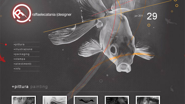
This is a web portfolio. Noitice how the font size is minimized so you can focus on the illustration?
Notice here, it's difficult to focus one element.

Here we have outlined the page layout in red, to accentuate the unequal distribution of elements. Still, a nice balance is acheived by the use of negative space and hierarchy.